this site is password protected

United States Postal Service

Metrics Dashboard

Role
Data Engineer / UX Designer
Project Type
Data Analytics
Impact
Reduced operational costs by 24%
Tools
Python, Plotly, Figma

USPS manages thousands of international carrier generated routes (CGRs) spanning commercial airlines, international carriers, customs operations, and logistics partners. I designed and built an analytics and visualization platform that consolidated operational data across more than 2,600 international flight routes.

problem

Disconnected Tools

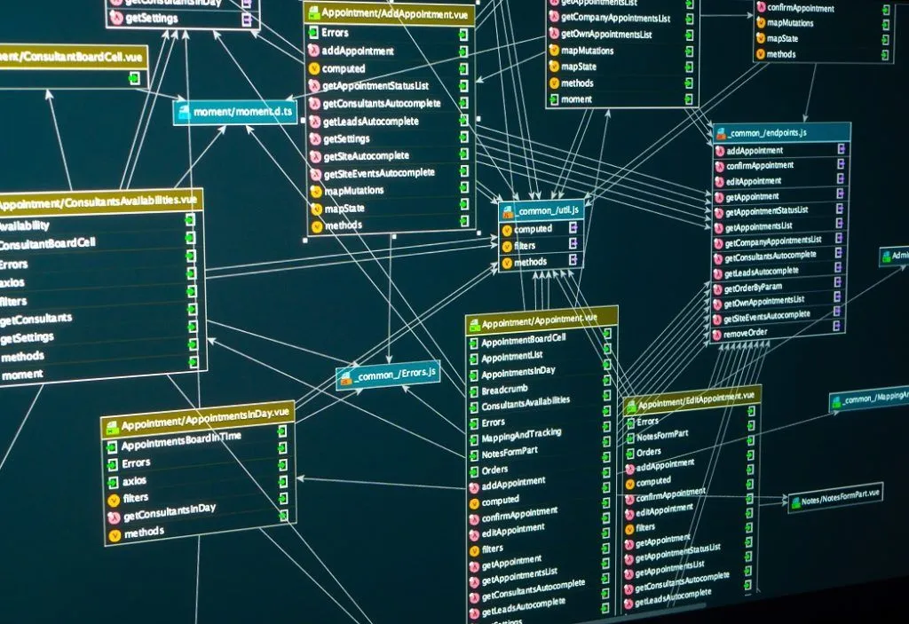
International logistics generated massive amounts of data across multiple government systems, spreadsheets, and reporting tools. The team spent significant time gathering data before they could identify issues or make informed decisions.

How might we create a centralized analytics platform that enables USPS leaders to monitor international logistics performance, detect fraud, and make proactive operational decisions?
user research

Identifying Blind Spots

I collaborated with USPS logistics, program managers, and data analysts to:

  • Understand CGR reporting workflows
  • Explore fraud detection opportunities
  • Evaluate decision-making processes
  • Determine executive reporting needs

key findings

Quicker Summary

  • The team crosschecked at least 4 large spreadsheets to manually generate CGR performance insights. Some were on platforms that required contractor sign-in, some on iCloud. Total validation time took around 6 minutes.
  • The team would like to pinpoint cost/performance issues and present mitigation strategies before carriers reach out on their end.
  • The team lacked a consistent way to identify anomalies and suspicious scanning behavior across routes.

competitive analysis

Existing Dashboards

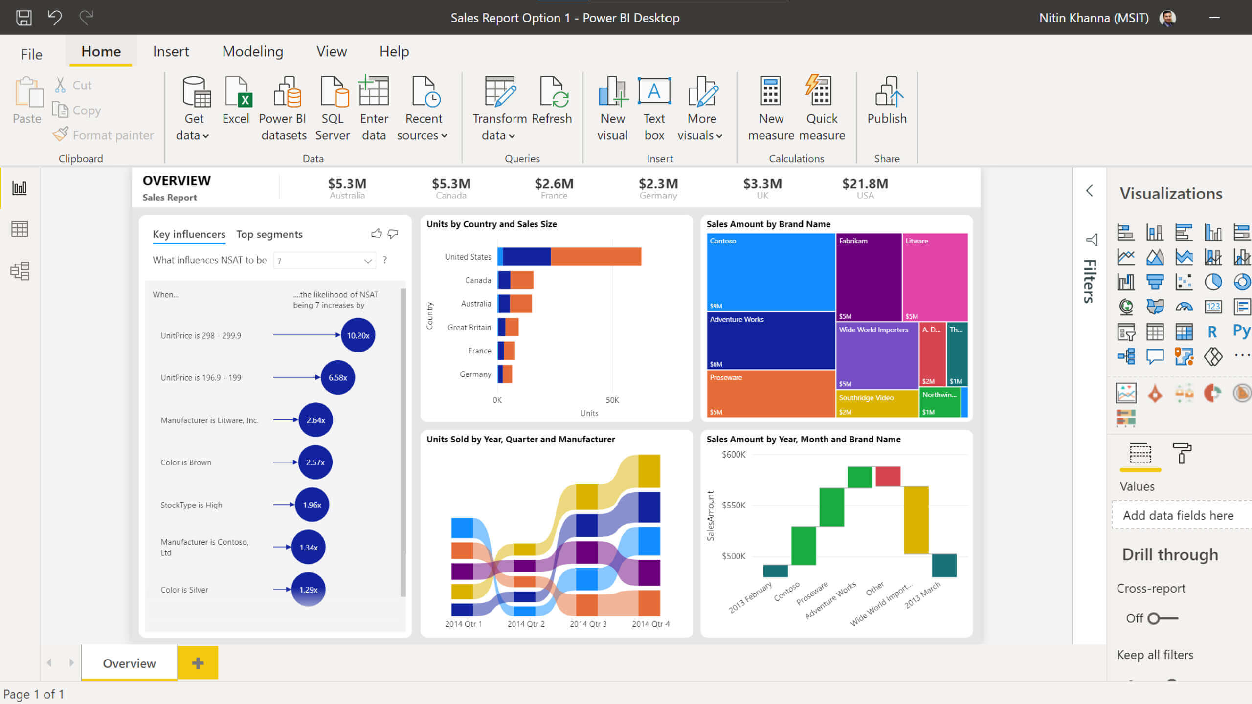
Because no unique, comprehensive USPS-specific dashboard existed, inspiration was gathered from enterprise analytics platforms like:

  • Tableau Executive Dashboards
  • Microsoft Power BI
  • FedEx Logistics Reporting
  • UPS Operations Dashboards

ideation

Visualizations

My iterations focused on 3 main pages for operations prioritization, clarity, and risk visibility.

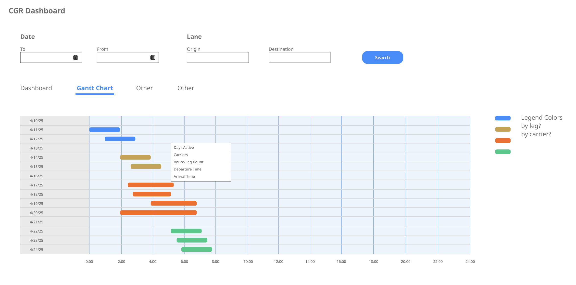
Gantt Chart

  • Filters (start/end date, origin, destination, carrier, operating carrier)
  • CGRs displayed by date, duration, route, and color-coded carriers
  • On hover — show further details like arrival/departure times, day count, leg number, etc.

Dataset Explorer

  • Carrier performance
  • Show further details like route capacity, trip number, contract number, etc.

Planned Routes / Heat Map

  • Forecasting, trend analysis
  • Route frequency across days of the week
  • Specific leg information

stakeholder validation

Meshing with Current Workflow

Through dashboard walkthroughs with team engineers and analysts, feedback was provided on:

results

Results

The interface leverages a two-panel layout that separates navigation and filtering from data visualization:

Left: Persistent control center, quick access to Gantt chart, tabular data, and route heat maps while maintaining a shared filter. Global filters such as date range, origin, destination, carrier, and operating carrier enable users to refine datasets and compare insights across visualizations without re-entering.

Right: Primary analysis workspace, presenting interactive visualizations that support data analysis. Hover states reveal more details. This improves discoverability, enhances data comprehension, and allows users to move between high-level and detailed insights.

takeaways

Less is More

Users did not need more data — they needed help to visualize and gather insights. Transforming complex operational data into intuitive visual experiences enabled faster decisions and measurable cost savings.

By aligning user needs, business objectives, and operational realities, the platform evolved from a reporting tool into a strategic decision-support product that delivered tangible organizational value.

← USSF FAA →