this site is password protected

Federal Aviation Administration

Digital Command Center

Role
Lead UX Designer
Project Type
Bid and Proposal
Impact
Centralized View, Faster Decision-Making, Competitive Proposal
Tools
Figma, Figma Make, Claude, Mural, Information Hierarchy, Systems Thinking

The Federal Aviation Administration (FAA) manages hundreds of initiatives that shape the future of the National Airspace System (NAS). I led the design of a decision-support dashboard that integrates project metrics and operational status into a single platform.

problem

Disconnected Systems

Managers tracked schedules and budgets in one environment. Ops monitored system performance in another. Leadership relied on manual reports to understand program health.

  • Limited visibility and delayed decision-making
  • Difficulty identifying risks before impact
  • Manual effort to summarize project status
How might we enable FAA stakeholders to monitor modernization efforts, assess operational impact, and proactively manage risk across the NAS?
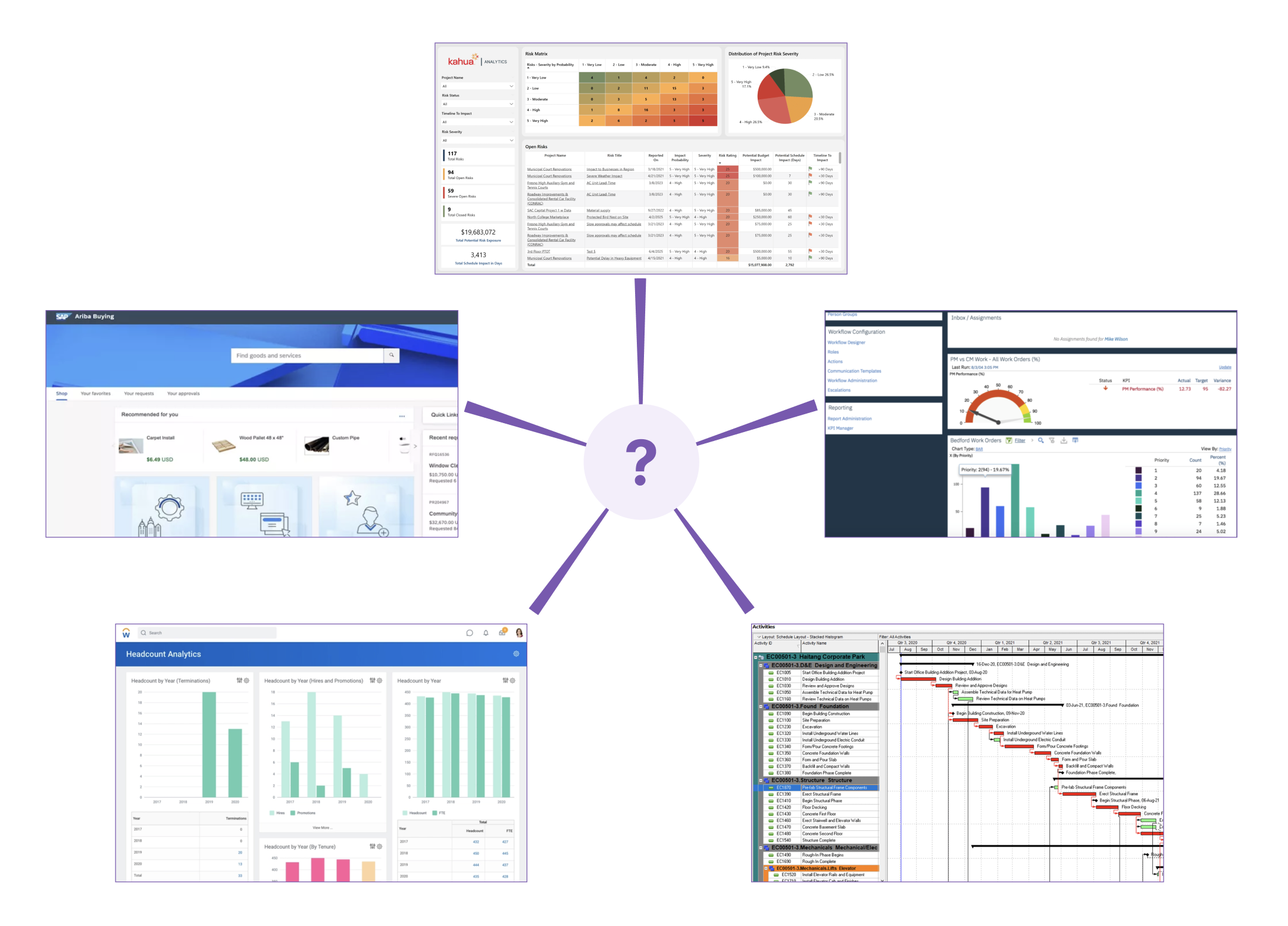
diagram of 5 different systems connected with ? in the middle

user research

Current Workflows

  • Qualitative: 10+ Interviews, Focus Groups, Journey Mapping, Personas
  • Quantitative: Surveys, CSAT/CES Scores, Task Completion Times
  • Biggest Takeaway: Design for different user groups. Executives benefit from high level views of cost, schedule, and KPI metrics, while program managers want granular detail into project health and recommended actions.

key findings

Pain Points

  • "On a bad week, pulling data from Ariba, Kahua, and P6 into a status report could take 3 to 4 hours."
  • "I can tell you what happened last quarter. It's hard to tell what's about to go wrong."
  • "I don't want the team to waste time on extensive manual reporting when they could be spending their efforts on improving ATC health."

requirements & goals

Overcoming Time Constraints

Since this was a month-long project, the project lead pushed for pretty aggressive milestones for completing parts of the dashboard. Impact vs. effort discussions: Will it be impactful in the proposal? What is the MVP?

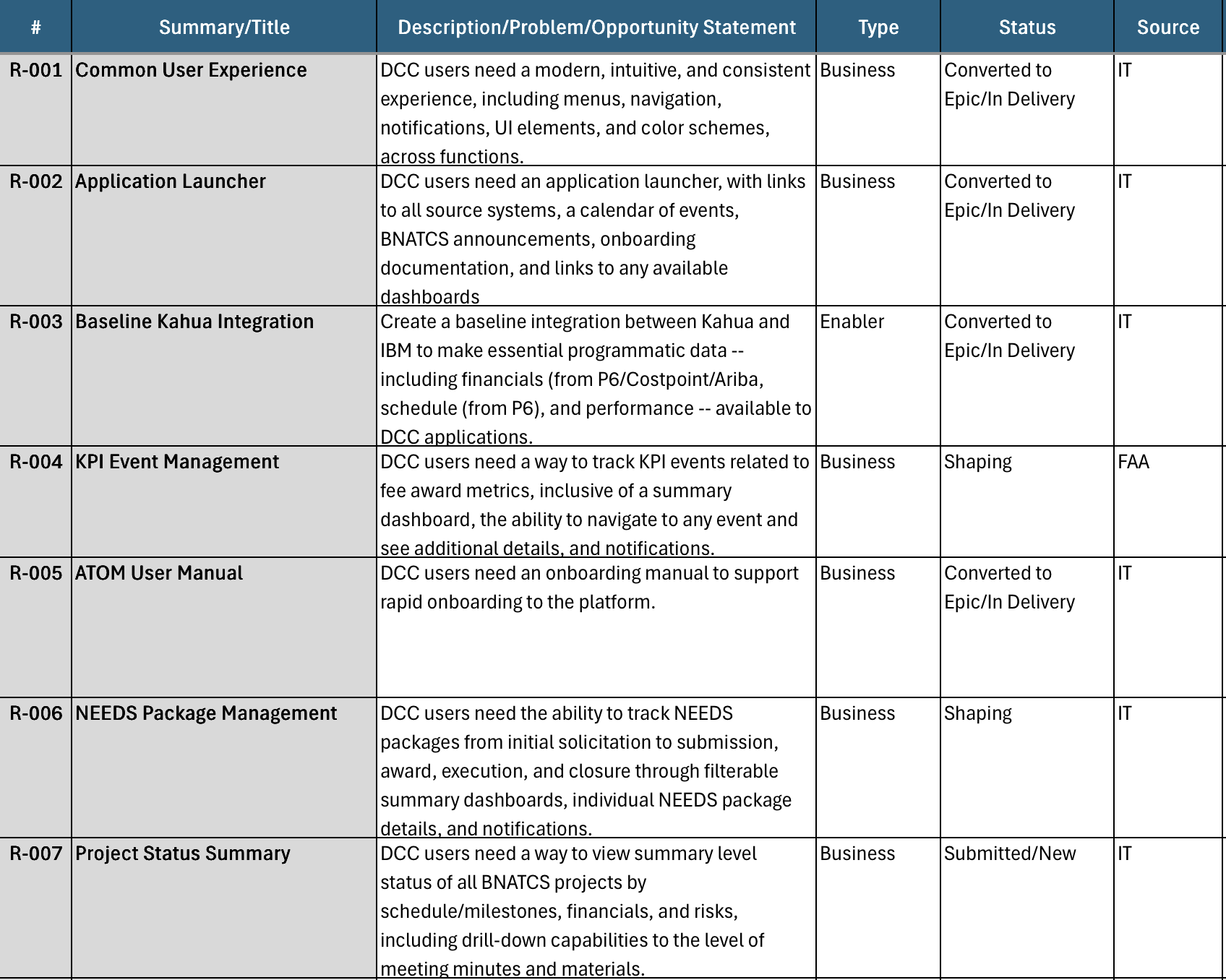
requirements table

ideation

Style & Layout

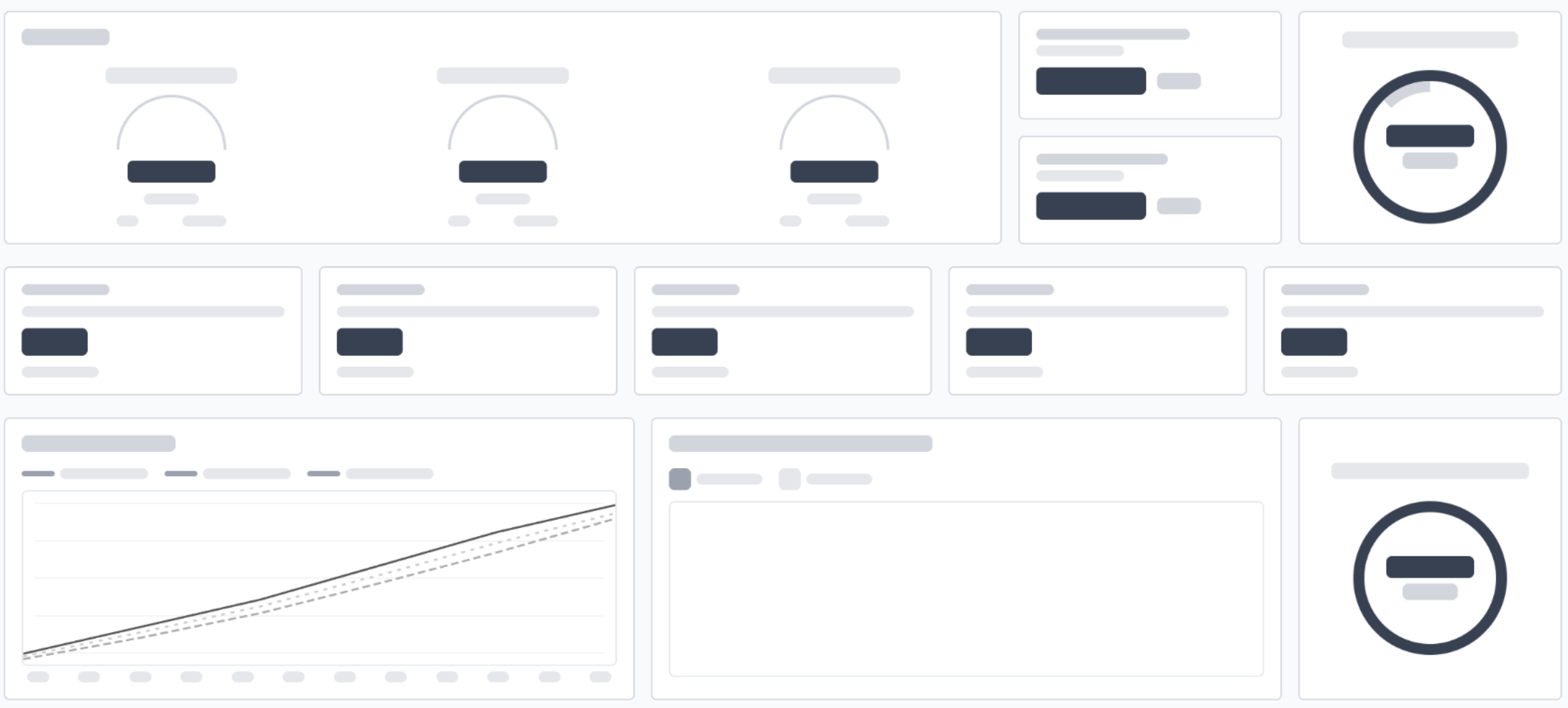
Since this dashboard was meant to be a static proof-of-capability graphic, it had to convince a proposal evaluator as a one-page, view-only, no scroll depiction. I experimented with the F/Z eye sweep pattern: left-to-right along the top, then drop down for a shorter sweep, then vertically down the left edge. I applied this across every view: primary, summary-level metrics top-left, and everything granular moving down and to the right.

brainstorming layout
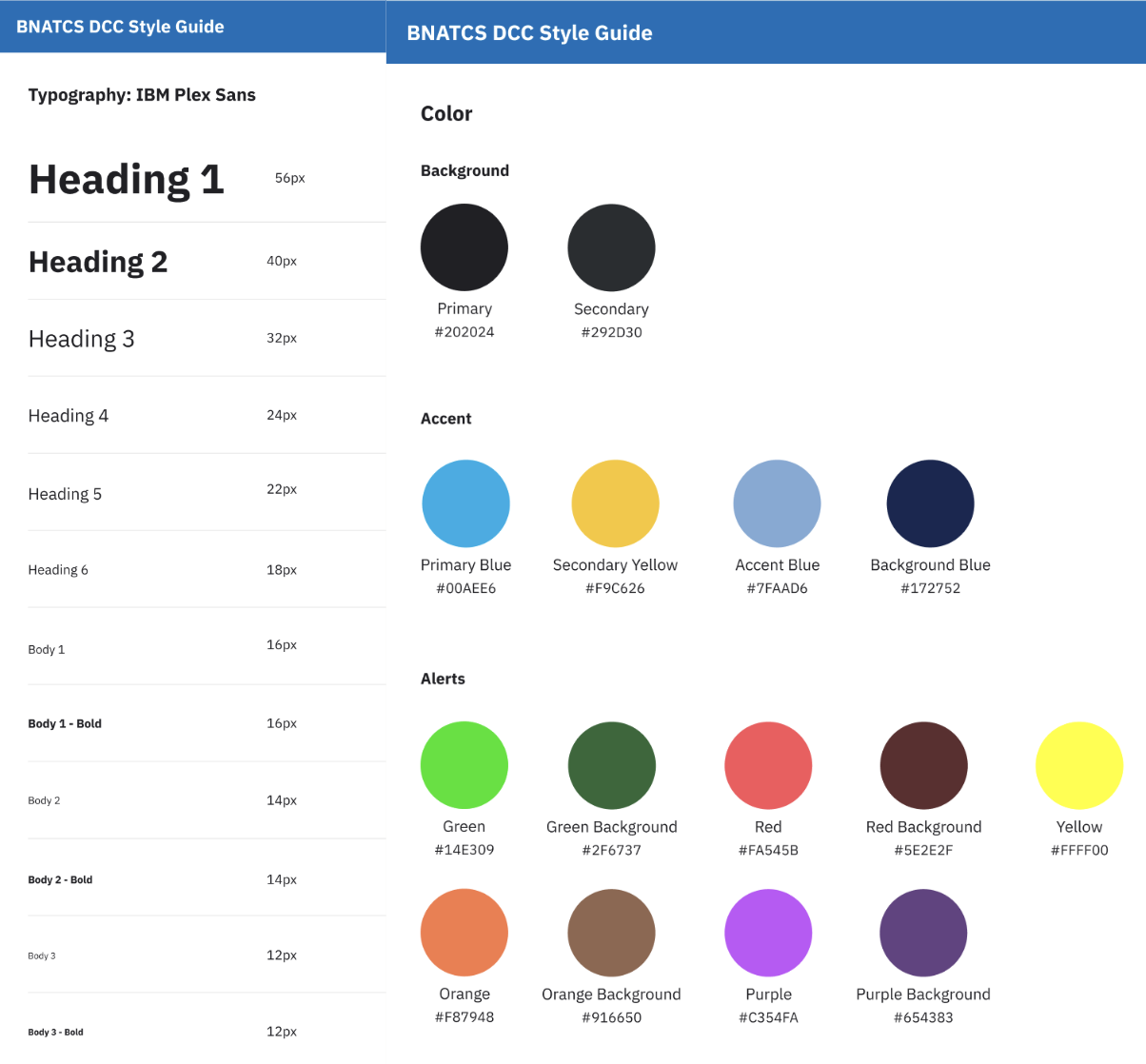
design system

stakeholder validation

Soliciting Feedback

I was theoretically designing for ATC operators who'd use this daily, but I was actually designing for the executives and evaluators who'd skim this proposal in a few minutes.

design iterations

results

Unified Command Center

Upon log in, users can view Announcements, Important Events, Employee Onboarding information, and various Dashboards and Applications to navigate to. These include Executive Status, Project Management, HR System, etc. Notifications/Inbox are located at the top right for easy access to any alerts or system updates. The ATOM Chatbot Assistant is present on all pages for additional AI-personalized guidance.

For the first time, FAA stakeholders can use this unified command center to understand modernization progress, operational impact, and emerging risks.

additional improvements

Looking Ahead

takeaways

A Single Glance

Even though I didn't design something usable immediately, I learned to design for a single glance. Experiences usually rely on first look, and within the first 5 seconds, a user should know what to do.

UX extends beyond visual and interface design. Combining user research, business objectives, and operational needs transforms platforms that government organizations depend on daily. Product strategy helped align user needs, technical feasibility, and organizational goals into a cohesive solution vision.

← all work USPS →